
Why the new logos?
DOCman used to have a logo back in the days. But since we released both LOGman and FILEman we are using the Joomlatools logo for our extensions everywhere. This was a good decision since it gave us a consistent and recognizable style.
The past couple of years we’ve had clients asking us to advertise and sell our extensions separately. Something we are working on to make happen. To be able to promote each extension individually we are also creating a shiny logo for each.
Keeping the consistency
Good design starts with a decent concept and a set of requirements, for the logos we used the following requirements :
- Needs to have an aspect ratio of 1:1
- Needs to have a horizontal version for smaller areas
- Should be based on a grid for easy extending
- Must be extendible (modules, plugins etc.)
- Needs to work in monochrome color
- All logos need to look good together
An aspect ratio of 1:1 allows the logos to be used in different kinds of situations. It’s very complicated to display a 4:1 aspect ratio logo in a skyscraper banner for example.
Another important thing was that the logos would be built on a grid. So if we’re building a new extension it will be easy to create a logo for it. Also if we release modules/plugins like the exporter tool for DOCman we could give them a logo as well.
When using logos in the real world you will always need a monochrome logo at some point. Placing your logo on an image background for example. Instead of dealing with this when the time comes we set out with the idea that the logos should also have a pre-built monochrome version.
And last but not least the logos should all look good together. At the same time they should differentiate enough to make them look like separate products.
Colors and font
We started with the two colors we already use everyday. The blue and grey of the joomlatools logo. We are using these colors everywhere so we better made sure our new colors would fit in nicely with the existing colors. These are the new colors we came up with:

The new colors we chose for our extensions
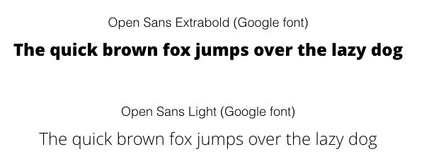
For the font we wanted to choose an open source one. This way the font is always available to everybody. Another requirement for the font was that it had a wide range of variations so we could work with “light” and “extrabold” font variations for example. We choose for the “Open Sans” font. It has 6 variations and looks good with the font we are currently using on our website.
Some ideas
The following image shows some ideas in the (digital) sketching phase
Sketchphase
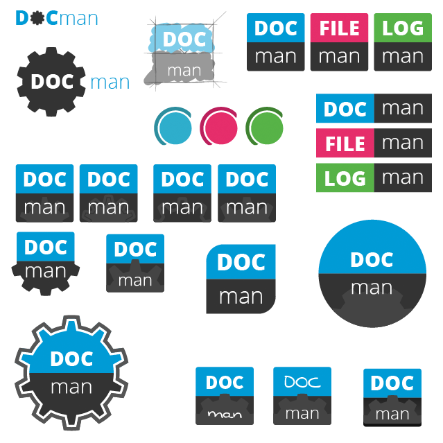
We quickly decided that the way we were using the font was the right way to go. The first part of the word would be written in capitals and use the “extrabold” font variation. In contrast the “man” would be written in lowercase and use the “light” font variation.
In this stage the first word was also still bigger than the second word. We changed this since there were too many differences. Extrabold + uppercase + bigger – versus – Light + lowercase + smaller. By making sure the height of the two words would be the same we took away one of the differences.
![]()
Icons
Logo not only need to look good they also need to be recognisable. Just using the “gear” icon doesn’t set them apart enough. We added a different icon for each. The icons we created are based on a 24×24 grid. The hard square edges are rounded to give the icons a softer look.

Assigning the colors and icons
Up until here we mainly worked with the blue and grey we already had but it was time to change that. Since DOCman had been using orange in the past we decided that orange would be the best color for DOCman. We got rid of the blue color since our website is using this color already.

Finetuning
To differentiate the icons even more we decide to remove the grey area in the logos. By doing this we would also get a cleaner overall look and it would be easier to use the logos anywhere since they would be monochrome at all times. Another thing we changed at the end was the rotation of the icons. The angles were nice and playful but removing them would get more serious logos.
For two more examples check out our slides on Slideshare : joomlatools-logos-a-logo-design-story
By setting the requirements beforehand we were able to create 4 beautiful logos which are easily extendable and look good both standalone as together. What do you think of the new logo’s ?