Now 2013 has come and gone we can see in our statistics that “desktop” machines are still on the winning side. However we can also see that the “mobile” side is gaining weight, on some sites growing with more than 10%.
Time for DOCman to join in and implement a complete responsive design. Here is an overview of the changes we are working on.
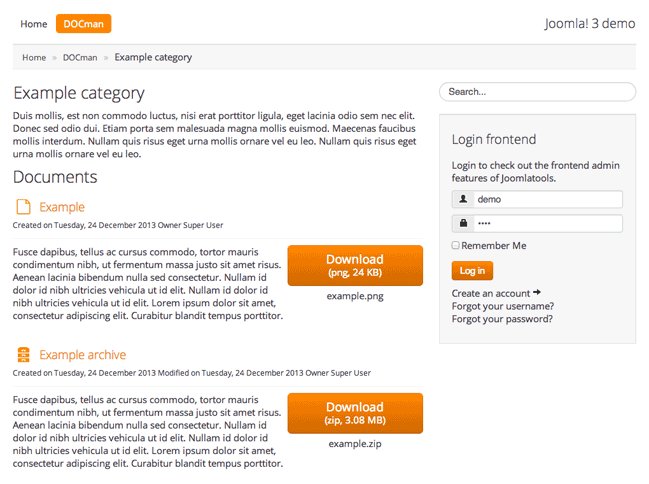
The new DOCman hierarchical document list layout.
Going responsive
One of the biggest changes we are making is going from a multiple column layout to a one column layout. This is needed to make sure we can be responsive across each and every Joomla template and device.
The problem with Joomla templates is that they are all different and we don’t exactly know what the template dimensions are, so we also have no idea when you have to go from a one-column layout to a two-column layout. The only way to solve this is by using a one column layout.
The nerdy details
Explanation why we went for a single column layout.
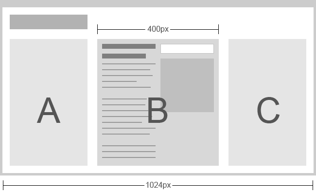
Say you have a website that looks like the image above. Area’s A and C are modules and area B is the docman component. At the moment we’re looking at a single document view.
When working with responsive layouts you only know the width of the browser window which in this case is 1024 pixels wide. So let’s say that in our component both the – title and text area – and the – download button/document info area – should at least be 250 pixels in width to look good and be readable. This counts up to 500 pixels in width.
We could do the following: If the width of the browser window gets smaller than 500 pixels make sure that the columns are stacked vertically instead of aligned horizontally. The only problem is that, as you can see in the picture, the parent element of the component container is only 400 pixels wide at this moment. So both columns are just 200 pixels wide which isn’t big enough.
We could add some JavaScript to calculate the width of the parent. But it’s a better idea to come up with a more solid solution that has a less heavy way of doing things. Thats why we ended up with a single column layout.
Other challenges
Next challenge. What are we going to do with all the info like “Created date” and “File Size” etc.? Placing them below the description might result in them falling off your screen if the descriptions get too long. placing them on top right below the title will almost always make your descriptions disappear on smaller screens.
That’s why we went for the third option. Placing all that info with already existing areas such as the download button and title.
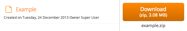
Our new title and button elements.
We moved the file size, document extension and document name to the download button and the created date, modified date and author was moved to a small subline right below the title.
When document titles are set to “direct download” the download button in document tables will disappear and the file extension and file size info will appear next to the title. Also the image of the document will never get bigger than 50% percent so the title will always be readable even on smaller screens.
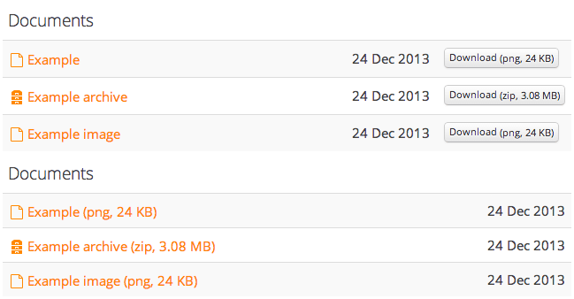
New DOCman table view without (first) and with (second) title as direct download.
Mobile First
For the user interface rebuild we used a mobile first approach. Mobile first means that you start designing/coding for the least capable machines. Old feature phones with a very basic browser for example. The more capable the device gets the more features you can add. The same goes for design. The wider the screen gets the more things you can align next to each other.
By making sure you work with a mobile first approach you can be sure that everybody is capable to view your content. This doesn’t mean that it looks the same everywhere. In contrary, it looks and works as good as it gets on that particular device.
When can I expect this ?
You can expect these changes in the final release of DOCman 2 which is in testing phase at the moment.